
Schein
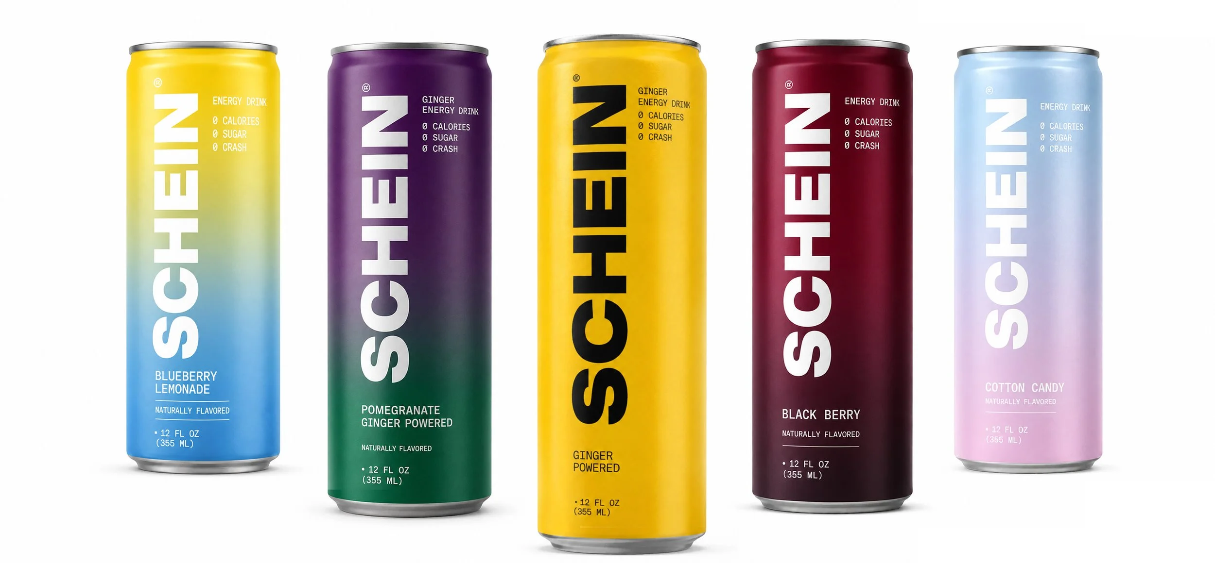
Explored three visual directions for a ginger-powered energy drink extension of ImmuneSchein.
Shortening ImmuneSchein to SCHEIN creates a more consumer-facing identity for the energy drink category. The simplified name feels bold, memorable, and easy to recognize at a glance.
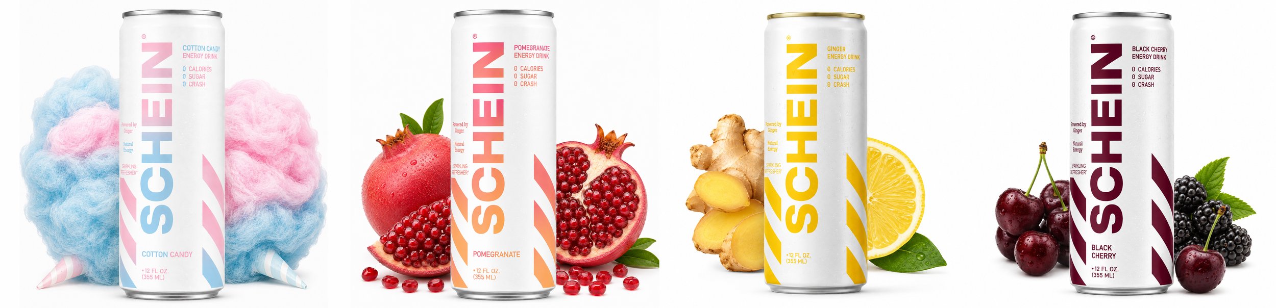
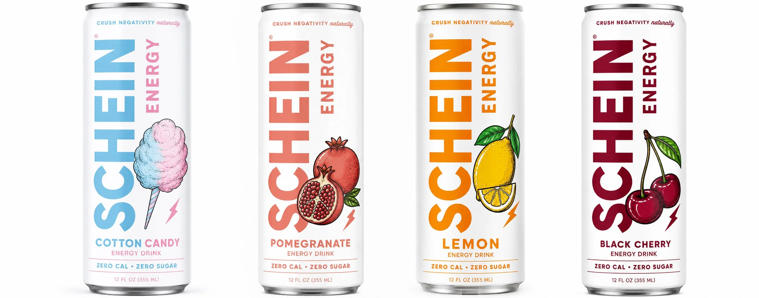
Each concept reimagines the brand for the energy category through bold typography, flavor-driven color, illustration, and packaging systems designed to feel fresh, modern, and shelf-ready.
The concepts range from minimal gradients to graphic patterning and playful illustrated flavors, exploring how SCHEIN could develop its own energetic identity while still connecting back to the original brand.